2014

2010
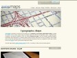
Typographic Maps - Axis Maps LLC - Cartography. Visualization. Design.
by 1 otherAxis Maps is pleased to announce the release of our mapping / art project Typographic Maps. Created as a labor of love, these unique maps accurately depict the streets and highways, parks, neighborhoods, coastlines, and physical features of the city using nothing but type. Only by manually weaving together thousands upon thousands of carefully placed words does the full picture of the city emerge. Every single piece of type was manually placed, a process that took hundreds of hours to complete for each map. Take a look at our blog for more on how these maps were made.
Fred Eerdekens
Entering the artistic space of Fred Eerdekens places the spectator in a semantic landscape in which what one had thought of as stable meanings are continually twisted and turned. What better way to figurize this than by letting the spectators themselves ‘twist and turn’ in trying to make sense of the objects. In spiralling around the objects, they in fact become direct figures of the play of logic that rules the objects. After the linguistic turn, and in the wake of post-structuralist thought, the topography of our mental landscapes has become increasingly intricate. The work of Fred Eerdekens attests to this fact and it provides a conceptual map of this, in many places still unknown territory.
2009
THINK ART | Marunouchi.com
by 1 otherMarunouchi.com is pleased to present special contents and screen savers in the unique Marunouchi “Think Art” style. Just pose for the camera!
by Yugop

H&FJ News | Hoefler & Frere-Jones
Most graphic designers choose the fonts that best fit their projects. Brian Hennings does the opposite: he chooses the projects that best fit the fonts. A resident designer at H&FJ, Brian shares with me the responsibility of creating all of the sample art you’ll find on this site. His is a strange universe of the fictitious: signage programs for mythical cities, book jackets for unwritten novels, product literature for items you cannot buy, broadcast graphics for live sporting events that you can’t quite identify.
2008
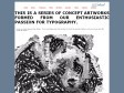
Concept Typography Artwork, Animal Kingdom
by 1 otherTHIS IS A SERIES OF CONCEPT ARTWORKS FORMED FROM OUR ENTHUSIASTIC PASSION FOR TYPOGRAPHY.

ABC3D
ONE OF THE MOST DELIGHTFUL AND INNOVATIVE POP-UP BOOKS I HAVE EVER SEEN.—Robert Sabuda
From the lenticular cover that changes with the angle of your hands, all the way to the Z, ABC3D is as much a work of art as it is a pop-up book. Each of the 26 dimensional letters move and change before your eyes. C turns into D with a snap. M stands at attention. X becomes Y with a flick of the wrist. And then there's U... Boldly conceived and brilliantly executed with a striking black, red, and white palette, this is a book that readers and art lovers of all ages will treasure for years to come.
MARION BATAILLE is graphic and book designer who has never before been published in this country. She lives in Paris. This is just a hand-made mock-up of the actual book which publishes in Oct. 2008. We couldn't be more excited about it.
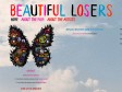
Beautiful Losers the Film
(via)Beautiful Losers celebrates the spirit behind one of the most influential cultural movements of a generation. In the early 1990's a loose-knit group of likeminded outsiders found common ground at a little NYC storefront gallery. Rooted in the DIY (do-it-yourself) subcultures of skateboarding, surf, punk, hip hop & graffiti, they made art that reflected the lifestyles they led. Developing their craft with almost no influence from the "establishment" art world, this group, and the subcultures they sprang from, have now become a movement that has been transforming pop culture. Starring a selection of artists who are considered leaders within this culture, Beautiful Losers focuses on the telling of personal stories...speaking to themes of what happens when the outside becomes "in" as it explores the creative ethos connecting these artists and today's youth.
The Style Press
Predominant daily news on fashion, art, design and pop culture

2007

For All Seasons
by 2 othersA piece about memories, seasons and using the elements of the textual representation of the memory to create an interactive one.
This is the result of over a year of late nights and weekends and the desire to completely disregard implementation and my current skill level when thinking up the concept for a piece.
Naturally much of the time was spent scratching my head and had I done it again now I would probably finish it in a much shorter time, but this is also a reason why I wanted to do it, the next time I make something I might get that extra bit closer what is in my head.
You know what they say about aiming for stars and hitting treetops.

2005
Susan Kare User Interface Graphics Portfolio Page 8
by 1 other (via)Imprimé et accroché au dessus de la cheminée, ça fera son effet...
Sinon portfolio d'une killeuse de l'icone systeme surtout pour Mac depuis des lustres
2004
1
(16 marks)