2014
Who Designed the Hamburger Icon?
(via)The hamburger icon is a classic. Even if you don't know it by that name, its three black bars are as familiar as your mouse's cursor—a constant companion on your cyber journey since the day you got your first computer. But who designed this icon?
Kill The Hamburger Button | TechCrunch
That little three-lined button is the devil. Whether you call it a side menu, navigation drawer, or a hamburger, hiding your features off-screen behind a nondescript icon in the corner is usually a poor mobile design choice. Interaction theory, A/B tests, and the evolution of some of the top apps in the world all support the same thesis: The hamburger button is bad for engagement, and you should probably replace it with a tab bar or other navigation scheme.
2010
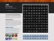
Glyphish – Great icons for great iPhone & iPad applications
by 10 othersDesigned and carefully optimized for use on toolbars and tab bars in iPhone & iPad apps, they're also perfect for Android apps, websites, t-shirts, tattoos and more.
2009
Matthew Rex
graphic • interface • web • video

Share Icon Project - An icon to represent 'sharing': posting to social sites, sending by e-mail, etc.
by 1 otherThe Share Icon is becoming the de facto standard visual representation for sharing content from any source to multiple destinations: over email, to bookmark or memetracker sites, to your friends on social networks, and more every day.
GraphicDZNR » Home
Jesse Dodds is a designer who creates print media, web and interface elements.

IMPLODR » Blog Archive » Icon Intermission at C4[1]
(via)I get asked a lot about how I created my QLab icon. At some point I’d love to go a little bit more in-depth about that — I actually made a polished presentation about it for my interview at Apple — but in the meantime, here’s a video of my short icon talk that I gave at C4[1]. Enjoy!
2008
10 Mistakes in Icon Design - TurboMilk
by 3 othersIt is much easier to criticize somebody else’s work than to create something cool yourself. But if you apply a systematic approach to criticizing, make a numbered list and prepare illustrations, it will be regarded as a fully-fledged analysis! In my opinion, icon design is undergoing a transitional period. On the one hand, screen resolutions are increasing, hence enhancing icons. On the other hand, we still have good old pixels. Icons sized 16×16 and even smaller are still widely used. And so, here are the most commonly observed mistakes in icon design…
The Mother of All Happy Macs Gives the Gift of Web 2.0
The trash can. The happy mac. The bomb. The visual language of point-and-click computing came to life in the imagination of Susan Kare, a fine arts curator hired by Apple in 1983 to design the look and feel of the Macintosh interface. Her whimsical, easy-to-grok icons tempted even nontechies to pick up a mouse, and her sleek screen fonts — with jet-set names like Geneva and Monaco — launched the first wave of elegant digital typography.
2007

the PIXEL IMPLOSION!
by 1 otherThe Pixel Implosion is a small, Denver-based graphic factory. It's so small that, in fact, Bobby Andersen is the sole employee. Despite this lack of manpower, the 'implosion and Bobby Andersen have been known to create all sorts of things for clients, such as interfaces, web sites, icons or anything else that has been thrown at them. The company has built its foundation on the pursuit of pixel perfection and a never-ending ambition.

mezzoblue § Icon Design: Anti-Aliasing
by 1 otherThe last time I wrote about icon design, I explained why it’s necessary to produce variations of an icon at different sizes. At small sizes in particular it’s important for icons to respect the pixel grid, enough so that extra work modifying the basic icon outline is usually required.


Bartelme Design | Microformats Icons
by 2 othersI think it’s time to inform you about a small project I worked on together with Chris Messina from Factorycity. As Microformats have gained much popularity over the last year we thought it was time to standardize the way they are represented on a website. So we created the Microformats Icon Set.
2006

TinyMCE Javascript Content Editor by Moxiecode Systems AB
by 30 othersTinyMCE is a platform independent web based Javascript HTML WYSIWYG editor control released as Open Source under LGPL by Moxiecode Systems AB. It has the ability to convert HTML TEXTAREA fields or other HTML elements to editor instances. TinyMCE is very easy to integrate into other Content Management Systems.
The Skins Factory - The World's Premiere Interface Design Company
by 4 others (via)Founded in 2000 by rogue interface enthusiasts with a bold vision and a passion for all things GUI, The Skins Factory has quickly grown into the world's premiere service provider for truly innovative graphical interface solutions. Our reputation has been built by an unprecedented commitment to excellence in all aspects of the interface development process - from start to finish our clients quickly realize that they've made the best possible choice in deciding to work with The Skins Factory.
graphpaper.com - Microsoft Word’s Useless Buttons
It’s not bragging (in fact, it’s probably a little embarassing) for me to say that I am an expert user of Microsoft Word. I can do just about anything I want with it, and I understand most of Word’s idiosyncracies and tricks. Still, the UI has always seemed to get in my way. For example, there are a ton of buttons I never use — so for kicks I decided to see just how many.
Subtraction: Little Orange Icons
(via)The world of XML syndication is still a soup of acronyms and counter-intuitive terminology — RSS, Atom, XML, feeds, aggregation, ’casts, etc. — but at the very least, we’re inching towards visual standardization in how we represent it iconographically. Microsoft, in an uncharacteristic but laudable show of cooperativeness, agreed late last year to adopt Firefox’s orange RSS/XML icon — a rounded little square with featuring what might be best described as ISO-style broadcast waves — for its Internet Explorer 7 browser.

HtmlTextbox_Standard_CS
The editor below represents the default settings. You can add and remove tools using both server-side code and control designer in your IDE.

FCKeditor - The text editor for Internet
Interface et skin de l'editeur wysiwyg fckeditor
2005
Les icônes à l'écran : Une sténographie de l'interactivité
by 5 othersLes icônes sont les signes affichés à l'écran qu'utilise un usager pour naviguer, jouer ou transiger dans un système interactif.
2004

GUIdebook: Graphical User Interface gallery
by 6 othersWelcome to guidebook, a website dedicated to preserving and showcasing Graphical User Interfaces, as well as various materials related to them. mac windows linux unix and others
1
(22 marks)