2014
'Pinch' connects multiple smartphones and tablets together to make a display | The Verge
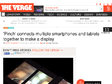
Not content with synchronizing your phones to make one giant speaker? Researchers at the Tokyo University of Technology have developed "Pinch," an interface that lets you connect multiple devices together to form a giant disjointed display. Although the technology behind the interface remains a mystery — described only as a Wi-Fi based system — a video posted by DigInfo TV shows Pinch in action. To connect two devices, a user simply needs to pinch two adjacent screens together. The screens can be linked together in whatever alignment you choose, as the position and screen size of each display is communicated on a successful pinch. It's not the first time developers have managed to link together multiple smartphone displays, but this is definitely the slickest interface we've seen.
2013

Des applications et des services pour marier télé et tablette
La création du département "Nouvelles écritures" au sein du groupe public en août 2011 a clairement imprimé le rythme aux équipes de production. Des pages Facebook dédiées aux émissions, en passant par des applications tablettes et smartphones d'information en temps réel (FTV Info) ou de télévision de rattrapage (Francetv Pluzz), avec guide TV, direct et personnalisation, tous les secteurs sont abordés. France 5, quelques mois après le lancement de son application Zouzous destinée aux enfants, va bientôt proposer un nouveau service sur iPad rattaché à l'émission "C à vous", afin de mixer social TV et télé connectée, de façon immersive et synchronisée (par marquage sonore) en direct avec l'émission diffusée à l'antenne. Les espaces cuisine, séjour ou salle à manger du loft d'Allessandra Sublet permettront de retrouver les éléments diffusés et d'interagir avec les chroniqueurs et les invités.

« Devant ma TV » : on a testé l'expérience second écran de M6 - Page 1 - PC INpact
Depuis quelques mois, les chaînes de TV ont décidé de se lancer dans les expériences de second écran. Un concept que nous avions approché lors de l'arrivée des nouvelles chaînes de la TNT, mais qui se renforce avec des applications de plus en plus complètes. Désormais, vous pouvez regarder, commenter mais aussi interagir avec le programme. Une belle promesse qui pourrait cacher des choses intéressantes... ou pas. Nous avons décidé de faire le point en commençant par « Devant ma TV » de M6, exploité pendant l'émission « J'ai décidé d'être heureux ».
2012
Guardian Eyewitness app | Guardian mobile | The Guardian
Unlock a world of quality photography
Multiscreen Patterns | precious, strategic design & visual language
(via)During the last years, our design studio has been involved in many different projects – from designing mainly websites and desktop software in our early days, to smartphone apps, prototypes for TV interfaces and more recently, applications for tablet devices.
Working for all those devices was interesting and challenging. Not just because of the diverse screen sizes and input methods, but because we learned in our user research how different the contexts are in which these gadgets are used.

RichCommerce.fr » Archive du blog » Vers une standardisation des bannières riches mobiles » RichCommerce.fr
Lancée en fin d’année dernière, l’initiative Rich Media Designs for Mobile de Google se présente sous la forme d’une série de gabarits standardisés de formats publicitaires enrichis pour les smartphones et tablettes. Une démarche qui a visiblement reçu le soutien de la profession avec cette distinction récemment acquise : IAB names Google winner of their Mobile Rising Stars contest.

Team Coco To Go @ TeamCoco.com
Are you Team Coco? Sure you are. So check out your mobile options for keeping up with the latest from Conan O’Brien & crew. It’s like having a teeny-tiny late-night talk show with you at all times — in a sexy techno-gizmo that vibrates!

3D ARchitecture App - Google SketchUp on iPhone & iPad
Make your Google SketchUp models mobile on the iPhone and iPad
With the App for architects and building professionals.
Now available on the App Store here! FREE to download with sample model included.
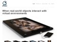
ePawn
by 1 otherThe ePawn Arena is a revolutionary yet affordable 26” screen that interfaces with smartphones, tablets and PCs to allow gamers to use real world game pieces with their online and mobile games.
Leveraging ePawn’s patented real-time object-tracking technology, the ePawn Arena bridges real- and virtual-gaming by bringing back the simple thrill of real touch feeling.
2011

Introducing the new responsive-designed BostonGlobe.com | Filament Group, Inc., Boston, MA
The Boston Globe flipped the switch today on its accessible, progressive enhancement and responsive-design based subscription news site. As front-end development leads on the project (with Ethan Marcotte at our side), we're very honored to have been involved.
Mobile HTML5 - compatibility tables for iPhone, Android, BlackBerry, Symbian, iPad and other mobile devices
by 5 othersTrying to understand HTML5 compatibility on mobile and tablet browsers
Mobify—The Leading Mobile Web Platform for E-commerce & Publishing
Mobile E-Commerce is growing rapidly—is your online store mobile-friendly? See the latest mobile commerce solutions from Mobify.
2010
García Media | Homepage
print
Redesigning newspapers and magazines to engage and inform today’s hurried readers.
online
Creating user experiences that reach new media consumers more effectively.
mobile
Providing cutting-edge ideas for mobile content delivery to mobile devices.

Condé Nast Study Concludes iPad Is Not A Mobile Device (At Least Not Now) | paidContent
There have been over 3.8 million downloads of Condé Nast apps on the iPad and iPhone since the publisher began rolling them out. Over the past few months, Condé Nast has been surveying readers of its GQ, Vanity Fair, Wired and Glamour apps and has found that these users are generally not the early-adopters or Apple (NSDQ: AAPL) fanboys the publisher expected.
Other Edition | Reading Room
Other Edition is the leading developer of iPad, iPhone and digital magazine experiences - working with publishers and titles in over 20 countries and with brands to create great experiences for digital and mobile audiences.
Our magazines have an audience of 4.3 million people - this audience is global, growing fast, and they are "super-influencers".
Working with Apple, one of our main titles - the revolutionary culture, entertainment and fashion title, Interview magazine - is presented in over 210 Apple storefronts worldwide. Apple showcase it on gigantic iPads as "the best way to enjoy your favorite magazines". We agree - our iPad platform featured in Apple stores is our 1.0 experience, September marks the launch of our third generation 3.0 reader experience. This third generation platform launches 10 new functionalities including multitouch, broadcasting, shopping, dynamic navigation, enhanced in-page video play, brand channels, better in-app browsing, engaging new page-turn in landscape mode, and a subscription service.
Backelite, Accélérateur de Stratégie Mobile
Les équipes Backelite sont expertes et référantes sur la conception, le développement et l'intégration de vos sites ou applications iPhone/iPad, Android, mais aussi Windows Phone, Blackberry et prochainement BADA...
Sencha - Sencha Touch Overview - HTML5 Mobile App Framework
by 4 othersSencha Touch is the world's first app framework built specifically to leverage HTML5, CSS3, and Javascript for the highest level of power, flexibility, and optimization. We make specific use of HTML5 to deliver components like audio and video, as well as a localStorage proxy for saving data offline. We have made extensive use of CSS3 in our stylesheets to provide the most robust styling layer possible.
Panelfly | Revolutionizing Mobile Comics | Home
by 1 otherIntroducing Panelfly, the new standard in mobile comics for the iPhone and iPod Touch platforms.
Panelfly is an all encompassing comic resource, offering users a inline mobile store, complete library functionality, sequential panel navigation, bookmarking capabilities, and a unique page index menu.
1
(18 marks)