2016

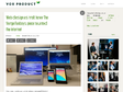
Web push notifications - mobiForge
Web push notifications are the best thing to hit the web since the hyperlink! No kidding, this technology is going to be huge. Until recently web developers could only dream of push enabled web apps.
Messaging is just getting started - Inside Intercom
Messaging isn’t about text. It’s about conversations. Here’s why the simplest apps on your phone are quickly becoming the most powerful.
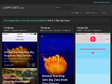
It’s Time For Notifications To Get Smart - Inside Intercom
(via)My phone buzzed. I was somewhere in Iceland. More than ten miles from my car and any other human being. Holding a phone with a dying battery. I turned it on to check Google Maps.
Design is a conversation - Inside Intercom
(via)Conversation is such a great way of achieving clarity of thought, even if you’re just talking to yourself.
2015

Design in Sketch Then Animate In Keynote — Medium
We know design is important in today’s uber tech world; but it still happens, in many teams design thinking ends up at a stand still once the deliverables are passed down the chain to marketing or development.
Characteristics of a well designed user interface
"Designing a good user interface is like tightrope walking: it's all about finding the right balance."

PwC. The right people to get the extraordinary done.
by 2 othersWith the right team working with your business, truly extraordinary things can happen, whether it’s helping a domestic airline fly internationally or a major research hospital innovate new ways to combat diseases. From advisory services to assurance, PwC gets the extraordinary done.
Best practices in online captioning
In 2003–2004, I worked for the TILE project, a university research program in accessibility of “learning objects” in education that was funded by Industry Canada. My topic was “best practices in online captioning,” about which little has been written.
I was hoping to have a few demonstration projects to show you, but then again, demonstration projects are pretty much all we've got in online captioning. I did write the following chapters.
Sous-titrage des vidéos: optimiser leur aspect pour améliorer l’expérience utilisateur | Qelios Expertise – Accessibilité Web
by 2 othersLes référentiels d’accessibilité indiquent que les sous-titres synchronisés sont des éléments nécessaires à l’accessibilité des vidéos. Ce besoin concerne notamment les personnes en situation de déficience auditive, mais également les personnes ne maîtrisant pas la langue du contenu, ou ayant généralement une compréhension améliorée du contenu vidéo lorsqu’il est sous-titré.
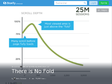
There is No Fold (avec images, tweets) · xiwcx · Storify
Luke Wroblewski went on a pretty great twitter tear debunking the persistent myth of "the fold" in contemporary (read: multi-device) web design. For posterity, here are all of the tweets including links to the sources.
2014

Nike's New LED Basketball Court in Shanghai | CreativeHunt
Nike and AKQA built this ultra-flashy LED basketball court with motion sensors that track players' movements. It's called the "House of Mamba", named after Kobe Bryant, and it is the future.

5 | 5 Things UX And UI Designers Could Learn From Wes Anderson | Co.Design | business + design
Director Wes Anderson has always been distinguished for his visual artistry, detail-rich sets, and storybook-like imagery. From the whimsical, campy feel of Moonrise Kingdom to the carefully crafted sets and miniatures in The Grand Budapest Hotel, Anderson’s movies are visual masterpieces.
Google Is About To Take Over Your Whole Life, And You Won't Even Notice | Co.Design | business + design
GOOGLE'S NEW DESIGN ETHOS, LIVING ON AND BEYOND EVERY SCREEN, COULD MAKE GOOGLE AN AMORPHOUS PROBLEM SOLVER OF UNIMAGINABLE SCALE.
Introducing image grids — The Story — Medium
When you click the “image” tool during the drafting of your story, try selecting multiple picture files from the pop-up window. Then, watch how Medium automatically lays them into a grid, depending on the number of images you selected. You can also click any individual image to see it bigger.
Read Time and You — The Story — Medium
(via)Eons ago, a couple of Medium engineers got fed up. They were sick of having to scroll all the way down the page to see how long a story was. It was wearing out their trackpad, it was making their fingers sore, and they figured there must be a better way. So they sat down and devised a simple formula, and the Medium read time was born.
Web design as troll: how The Verge Fanboys piece taunted the internet | Vox Product Blog
How do you speak to a group of extremely passionate people? What kind of design would speak to them? When Joshua Topolsky approached us about creating three different layouts in the style of three mobile UI’s we were initially torn. Something about mimicking the UI of phones didn’t feel original. But more importantly, it presented a problem of presentation. There was an inherent a UX problem to solve: do you offer presentation options or do you trick the user? We decided to troll.
capptivate
by 1 otherBack in June of 2013, I launched Capptivate.co: a kinetic pattern library that captures and preserves delightful iOS animations. For an overview of the thinking behind the site, how to use it, and info about the tools I used to build it, read this post.

Beyond Kinetic
by 1 otherI have been a motion designer at ustwo since 2007 and this "Blog" is a chance for me to share my views on all things motion in and around the world of interaction and mobile interface design.

Motion Ui Design Principles — Beyond Kinetic
This blog is a quick look at some simple Ui motion design principles. There isn’t too much documented about this area of mobile ui design and I thought there would be some value in expressing my views. From what is documented already I urge anyone interested in ui motion to check out Pasquale D’Silva http://psql.me/ and Johannes Tonollo’s meaningful transitions http://www.ui-transitions.com/#home.
by alice lee | carousel
(via)Carousel is the new gallery from Dropbox that helps you organize, share, and save your photos and videos with friends and family (remember having to individually send every photo in a set over iMessage? Yeah, no more!). It’s an app that holds your photos and videos, and therefore your memories - and its story needs to do it justice.
Hold the hamburger | Isotoma Blog
I’ve noticed a worrying trend in web navigation lately. More and more websites are hiding their navigation – at desktop resolutions – under a single button, often the 3-bar “hamburger” icon.

2013

Interactive Experiments on the open
by 2 others (via)I'm a Swedish engineer that loves working with interactivity, graphics and animation. I'm motivated by a need to create distracting interactive contraptions and obsessive about pushing the open web into unexpected places.
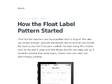
How the Float Label Pattern Started
I first had the idea for a new input pattern back in August. The idea was simple enough - animate placeholder text to show an icon beside the input so you don't lose your context. I've been doing 99% mobile work for the past 2 years and little things like this can really add up. I wanted a solution that saved space, looked clean and clear, but didn't forego usability.