2016
Regular Bold Italic
Regular Bold Italic (RBI) is a collaboration between Jeff Schreiber and Timo Kuilder. Two Dutch graphic designers with a passion for letter design. It's true that we didn't spend years and years creating the new DIN or a twenty four-folded Helvetica. Our perfection lies in exciting shapes and fonts with character.
BLKBK | Quality Fonts & Handset Vector Type - Headline/Display/Scripts Fonts
BLKBK is a graphic design and visual communications studio specializing in type, lettering, brand identity, art direction, and design for print and web.
2015
The Fonts - Lato
Lato is a sanserif typeface family designed in the Summer 2010 by Warsaw-based designer Łukasz Dziedzic (“Lato” means “Summer” in Polish). In December 2010 the Lato family was published under the open-source Open Font License by his foundry tyPoland, with support from Google.
2014

Font War: Inside the Design World's $20 Million Divorce - Businessweek
Gotham is one hell of a typeface. Its Os are round, its capital letters sturdy and square, and it has the simplicity of a geometric sans without feeling clinical. The inspiration for Gotham is the lettering on signs at the Port Authority, manly works using “the type of letter that an engineer would make,” according to Tobias Frere-Jones, who is widely credited with designing the font for GQ magazine in 2000. Critics have praised Gotham as blue collar, nostalgic yet “exquisitely contemporary,” and “simply self evident.”

10 Foundries We Heart | Design in the browser with web fonts and real content — Typecast
As we bring February to a close—a month for all things lovey dovey—Jake and Dan have teamed up to bring you 10 of typography’s most crush-worthy foundries.
2013
PintassilgoPrints
“WHIMSICAL, EXTRAVAGANT AND SO INFUSED WITH CHARACTER”
Is a bit of what’s being said about our fonts. (And we are delighted to hear it.)
2012
Type Foundry | 29 Arabic Letters | Droid Naskh
Droid Naskh is an Arabic type designed in 2010 for use in Google™ products such as Google Chrome™ and Android™. Designed to complement the Latin, Greek and Cyrillic provided in the Droid Serif family, the Arabic matches the color, alignment and design detail of the Droid Serif allowing them to be used together for multi-lingual typesetting. This Naskh style is optimized for reading Arabic script on screen.
Droid Naskh was designed in collaboration with Ascendercorp and Google to ensure that all the requirements for a screen and web font are met. Google performed several surveys and tests on the fonts during the design and development process.
2011
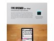
Suitcase Type Foundry - iPad application
A new generation of type specimens.
Type Specimen is the first font viewer for iPad, revolutionizing the way digital fonts are presented today. It's an ideal tool for people who need to select fonts for projects - be it magazine design, corporate identity design, web applications, or book typesetting. Type Specimen is a quick and easy way to navigate the type foundry, containing over two hundred original font styles. Type Specimen allows you to categorize individual fonts, make comparisons, or see details of specific glyphs. All of this for free of course.
2010

Font | MORISAWA
Without difficulty, Japanese people use a combination of four different types of character systems: kanji,hiragana, katakana, and the English alphabet. This is a very unusual system not seen in any other country in the world. Each of the kanji characters, forming the core of the Japanese writing system, usually serves also as a word. Elements of Japanese culture have been embedded in these kanji characters through their forms and images. In addition,most kanji characters have two or more pronunciations and a variety of meanings.
FF DIN Web Pro | Font Download | FontShop
Web fonts are optimized for use on the web and will work only in web browsers.
Buy fonts at FontShop, host them on Typekit « The Typekit Blog
(via)It’s hard to believe that it has only been three months since we launched Typekit — so much has happened in the webfont world in such a short time. We’ve been inspired recently by beautiful redesigns, increasingly sophisticated browser support, and many more foundries choosing to embrace @font-face.
2009
Carver & Veen {39} Typekit - Podcast Episodes - CreativeXpert Design Interviews
Typekit Makes Sites Pretty. That should be enough, but there’s so much more!
In this episode, Ryan Carver and Greg Veen join us from Small Batch Inc., the makers of Typekit.
Typekit aims to solve all of the problems that currently prevent web designers from using commercial typefaces in their designs. Every major desktop browser will support linking to custom fonts from within your site’s CSS using @font-face. You can then use these fonts on your web site without users having to install the fonts on their system beforehand. => This really is going to change web design

Typedia: A Shared Encyclopedia of Typefaces
by 6 othersA Shared Encyclopedia of Typefaces
Typedia is a resource to classify, categorize, and connect typefaces.

YouTube - Heroine a promotional trailer
A promotional trailer for the typeface Heroine. http://www.fountaintype.com... http://www.fountaintype.com... Heroine is inspired by the typeface Windsor, designed by Eleisha Pechey in 1905.
Fontfabric™ Type Foundry
by 8 othersOur goal is to create high-quality fonts which stand in a unique class of their own, and which will serve as a good base for any designer project whether it be web, print, t-shirt design, logo etc.
Every week, a new and totally unique font will be rolled out of production, which you can easily buy or download free of charge. To stay posted on the latest available fonts from our foundry, you can subscribe to our RSS feed.
2007
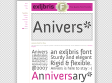
Anivers :: a Free Quality Font from exljbris
The name Anivers –as you might have guessed– is derived from the word anniversary. Anivers celebrates the anniversary of Smashing Magazine.
2006

Feliciano Type Foundry
Founded in 2001, Feliciano Type Foundry looks back onto its proprietor’s fundamental ideas and creative doings. Mario Feliciano (born 1969 in Caldas da Rainha, Portugal), since the early 1990s is a graphic designer by profession and a typographer by heart. After a year as graphic designer for Surf Portugal magazine, he opened his first own graphic design studio in Lisbon, called Secretonix, in 1994, besides giving lectures at various universities in Portugal and abroad.
Fontsmith
Fontsmith is a leading type design studio. We create bespoke fonts for corporate identity, working with design groups or direct with the end user.

typecuts - font store
typecuts is an independent font and graphic label, dedicated to create and produce original contemporary fonts for retail and custom use.
typecuts was founded in 2004 by Andrea Tinnes to publish and promote her own fonts which are available from this website as well as primetype.
With its few font families the typecuts fontlibrary offers a wide range of typographic forms:
from text faces over graphic fonts to dingbat illustrations.
Following Jeffery Keedy's paradigm keep the inconsistencies consistent typecuts typefaces seek to explore the relation between clear geometric construction and playful decorative form while considering historical contexts as well as contemporary tendencies in typedesign.
