public marks

PUBLIC MARKS from decembre with tags Responsive & viewport

05 February 2014

04 February 2014

CSS - Responsive Design - Break-points come from content

To me, it seems more realistic to check our layouts through viewports of arbitrary dimensions and shapes. We don't need anything fancy, we can simply drag the bottom right corner of our favorite desktop browser to enter... "Device Agnostic Mode".

02 January 2014

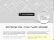
CSS - VIEWPORT BOOKMARKLET : Viewport resizer

by 3 others
Responsive design bookmarklet : Viewport resizer is a browser-based tool to test any website’s responsiveness.

decembre's TAGS related to tag Responsive

Adaptative +   analyse +   blog +   bookmarklet +   browser +   calc +   chrome +   cms +   css +   css3 +   CSSjavascript +   customiser +   demo +   design +   dev +   development +   device +   dom +   em +   firefox +   flexible +   fluid +   Google:Chrome +   guide +   html +   icon +   image +   implementation +   javascript +   layout +   lenght +   madia-query +   Media Queries +   media-screen +   media:queries +   mobile +   outil +   php +   picto +   picture +   polyfill +   px +   resize +   resource +   ressource +   s +   scale +   screen +   size +   solution +   srcset +   tool +   tuto +   tutorial +   tutoriel +   viewort +   viewport +   vw +   web +   webdesign +   width +