2022
upscayl/upscayl: 🆙 Upscayl - Free and Open Source AI Image Upscaler for Linux, MacOS and Windows built with Linux-First philosophy.
by 1 otherUpscayl - Free and Open Source AI Image Upscaler for Linux, MacOS and Windows built with Linux-First philosophy.
2021
Ojoy
Select a low-res photo or Memoji to enlarge it and improve its quality.
2013
Mobile Matrices · h5bp/mobile-boilerplate Wiki · GitHub
This is an attempt to compile a list of relevant specifications for all modern smart phones and mobile internet devices. It is primarily for a quick reference sheet when trying to target a specific platform with CSS media queries.
2011


A pixel is not a pixel is not a pixel - QuirksBlog
Yesterday John Gruber wrote about the upped pixel density in the upcoming iPhone (960x640 instead of 480x320), and why Apple did this. He also wondered what the consequences for web developers would be.

A tale of two viewports — part two
In this mini-series I will explain how viewports and the widths of various important elements work, such as the html element, as well as the window and the screen.


LukeW | Designing for the Retina Display (326ppi)
by 2 othersFor three generations of the iPhone, Apple kept the screen consistent (320x480 pixels and 3.5 inches diagonal). But now Apple's new iPhone 4 boasts the "highest resolution phone screen ever (960x640 pixels, 3.5 inches diagonal, & an 800:1 contrast ratio)." What's the impact to designers?
2009
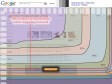
Browser Size
by 11 others (via)Google Browser Size is a visualization of browser window sizes for people who visit Google. For example, the "90%" contour means that 90% of people visiting Google have their browser window open to at least this size or larger.
1
(10 marks)
