2011
Conan O’Brien’s Farewell Speech in Kinetic Typography | The FontFeed
Just when you thought you’ve seen them all, along comes a kinetic typography project reassuring you that, yes indeed, there still is potential in the medium. This video was created by Jacob Gilbreath, a graphic design student at Oklahoma State University with an emphasis in motion graphics. It visualises a portion of the farewell speech from Conan O’Brien’s final episode of The Tonight Show on NBC. Conan describes his feelings about NBC and the situation at hand. His personality exudes positivity and humour, and this monologue characterises him very well. Even through the hardships of leaving NBC he promotes hard work and kindness.
2010
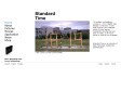
Standard Time
70 workers are building a wooden 4 x 12 m "digital" time display in real time: a work that involves 1611 changes within 24 hour period.
Seamlessly documented and shot on video, a 24 hours movie or clock is now available.
Standard Time is an artwork of Mark Formanek, realized by Datenstrudel.
2009
Typophile Film Festival 5 Opening Titles | The FontFeed
The 5th Typophile Film Festival premiered one month ago at Design à Trois, a three night event exploring rock poster design, book cover design, and type design, organised by Portland

YouTube - Heroine a promotional trailer
A promotional trailer for the typeface Heroine. http://www.fountaintype.com... http://www.fountaintype.com... Heroine is inspired by the typeface Windsor, designed by Eleisha Pechey in 1905.

WOOD by Mac Bess on Vimeo
illus, anim, typo, musique, ça envoie la sauce ! Vive la chiasse !

2008

Aviary - Creation on the fly
Aviary is a suite of web-based applications (RIAs) for people who create. From image editing to typography to music to 3D to video

The Art of the Title Sequence -
A compendium and leading web resource of film and television title design from around the world. We honor the artists who design excellent title sequences. We discuss and display their work with a desire to foster more of it, via stills and video links, interviews, creator notes, and user comments. Featuring opening title design for film and television from Croatia, New Zealand, Serbia, Russia, the United States, Brazil, England, France, India, Japan, Italy, Chile, Mexico, Yugoslavia and Egypt.

ABC3D
ONE OF THE MOST DELIGHTFUL AND INNOVATIVE POP-UP BOOKS I HAVE EVER SEEN.—Robert Sabuda
From the lenticular cover that changes with the angle of your hands, all the way to the Z, ABC3D is as much a work of art as it is a pop-up book. Each of the 26 dimensional letters move and change before your eyes. C turns into D with a snap. M stands at attention. X becomes Y with a flick of the wrist. And then there's U... Boldly conceived and brilliantly executed with a striking black, red, and white palette, this is a book that readers and art lovers of all ages will treasure for years to come.
MARION BATAILLE is graphic and book designer who has never before been published in this country. She lives in Paris. This is just a hand-made mock-up of the actual book which publishes in Oct. 2008. We couldn't be more excited about it.
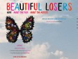
Beautiful Losers the Film
Beautiful Losers celebrates the spirit behind one of the most influential cultural movements of a generation. In the early 1990's a loose-knit group of likeminded outsiders found common ground at a little NYC storefront gallery. Rooted in the DIY (do-it-yourself) subcultures of skateboarding, surf, punk, hip hop & graffiti, they made art that reflected the lifestyles they led. Developing their craft with almost no influence from the "establishment" art world, this group, and the subcultures they sprang from, have now become a movement that has been transforming pop culture. Starring a selection of artists who are considered leaders within this culture, Beautiful Losers focuses on the telling of personal stories...speaking to themes of what happens when the outside becomes "in" as it explores the creative ethos connecting these artists and today's youth.

abcdefghijklmnopqrstuvwxyz : Journal : Mark Boulton
A few days ago, Keeran sent me a link to this video by Job & Roel Wouters. It’s such a beautifully simple piece. Watching Job draw the letterforms is mesmeric enough, but when his son (?) joins in, I found myself laughing as he tries to imitate his fathers work. This leads to some funny-looking characters (c and d are particular favourites of mine).

Video Justice - DVNO [NEW] - Justice, DVNO, NEW, Clip, FR - Dailymotion Partagez Vos Videos
So-Me, Machine Molle, Yorgo, Ed Banger...
Video Justice - DVNO [NEW] - Justice, DVNO, NEW, Clip, FR - Dailymotion Partagez Vos Videos
So-Me, Machine Molle, Yorgo, Ed Banger...
Le Houellebecq - type, motion, typographie, cinétique, animation - Dailymotion Share Your Videos
Fabrice luccini dans un élan de virtuosité littéraire, pendant une emission de radio, parlant de michel Houellebecq, retranscrite en typographie cinétique

2007

22nd Amendment
© Andrew Sloat
Music: “improv1” from Ptolemy's Guitar by Roland Satterwhite
FontShop Strange Attractors = Little Yellow Writing Hood
Le petit chaperon rouge vu pas Strange Attractors Design pour Fontshop

Ecrans - Zoom : Effets vidéo sautillants
Pris en une seule séquence, le film a été tourné en live le 30 juin dernier, lors de l’ouverture du festival Nederclips du Stedelijk Museum’s-Hertogenbosch et tourné à l’aide d’une équipe de professionnels du trampoline.


