2010
hyperurbain
Le blog Hyperurbain a été créé par le CITU (programme commun aux universités Paris1 et Paris8) en relation avec le colloque Hyperurbain (2006, prochaine édition les 3 et 4 Juin 2009) sur les nouvelles technologies de l’information et de la communication en milieu urbain, organisé par le Professeur Khaldoun Zreik (laboratoire Paragraphe à l’Université Paris 8). Il accompagne, en tant que veille « orientée usages », le développement du projet du pôle de compétitivité Cap Digital intitulé TerraNumerica, portant sur la numérisation des territoires et de leurs ressources, et la valorisation multimédia de ces informations, dans lequel le CITU est impliqué, avec de nombreux autres partenaires.

TransID : écomobilité, innovation, communauté.: Trois sources d'inspiration pour cartographier les transports publics
Les transports publics, leurs lignes, leurs directs et leurs omnibus, se représentent difficilement sur une carte traditionnelle. Pour notre bonheur, cette complexité excite l'ingéniosité des cartographes qui élaborent des systèmes de représentation souvent spectaculaires. Voici quelques exemples qui me semblent remarquables. Si vous en connaissez d'autres laissez un commentaire ou twittez moi un lien sur @transid.
2008
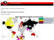
Leading surveillance societies in the EU and the World 2007
Map of surveillance societeies around the world
2007
The DIMES project
What does the Internet look like? How does it evolve?
DIMES is a distributed scientific research project, aimed to study the structure and topology of the Internet, with the help of a volunteer community (similar in spirit to projects such as SETI@Home).
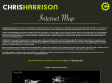
Chris Harrison - Internet Map: City-to-City Connections
The Dimes Project provides several excellent data sets that describe the structure of the Internet. Using their most recent city edges data (Feb 2007), I created a set of visualizations that display how cities across the globe are interconnected (by router configuration and not physical backbone). In total, there are 89,344 connections.
The first rendering displays the relative densities of Internet connectivity across the globe. The stronger the contrast, the more connectivity there is. It is immediately obvious, for example, that North America and Europe are considerably more connected than Africa or South America. However, it is important to note that this only reflect density of connections, and not usage. Hundreds of people may utilize a single connection in an internet cafe, often the only form of connectivity people have access to in developing nations.
Additionally, three graphs showing network connections were created. I should note this is not the first time graphs like this have been created - I've seen dozens of variations, most being practical in nature (e.g. cable locations, bandwidth). I decided to pursue an aesthetic approach - one more visually intriguing and interesting to explore than useful. The intensity of edge contrast reflects the number of connections between the two points. No country borders or geographic features are shown. However, it should be fairly easy to orient yourself.
Note: No projection has been applied to the geographical data. Latitudes and Longitudes were rounded to the nearest whole number and used in a flat coordinate system. This means that the planetary surface area represented by each point varies, skewing how the data (and densities - both point and edge) is shown!
1
(5 marks)
